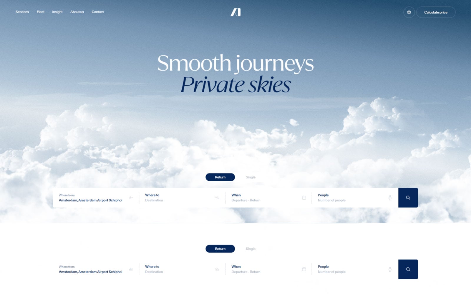
Aerodynamics
A whitespace-forward showcase built to let Dutch engineering speak for itself
The brief
Where we started
Aerodynamics is a Netherlands-based design and engineering firm producing precision consumer products. They needed a website as restrained and considered as the products themselves — no stock-photo energy, no unnecessary flourish.
Let product photography and engineering detail carry the page, not decoration
Build a calm, confident browsing experience for a design-literate international audience
Ship a fast, lightweight site that never competes with the product imagery for attention
The challenge
What we were up against
Aerodynamics' products are defined by precision and restraint — the website had to match that discipline instead of falling back on generic 'innovative tech company' web tropes: gradient blobs, stock photography, marketing buzzwords. Any visual noise on the site would have directly contradicted the brand's design philosophy.
The firm also serves an international, design-literate audience that would notice — and judge — any inconsistency between the physical product's craftsmanship and the digital presentation of it.
1
accent color used across the entire site — everything else is product, light, and space
What was at stake
A website that looked like a typical startup landing page would have quietly undermined the credibility of genuinely precise engineering work.
Our approach
How we tackled it
We art-directed how existing product photography should be cropped and sequenced so every image reads as intentional, not decorative.
Step 1
Product Photography Direction
We art-directed how existing product photography should be cropped and sequenced so each image reads as intentional, not decorative.
Step 2
Typography-Led Layout
A restrained type system carries most of the visual weight, letting large product imagery breathe in generous whitespace rather than competing with busy layouts.
Step 3
Scroll Rhythm Design
Smooth, understated scroll transitions between product, story, and spec sections keep the pacing calm — nothing snaps or bounces.
Step 4
Lightweight Development
Built lean from the start — no unnecessary scripts or animation libraries — so the restrained design is matched by a genuinely fast, restrained build.
The solution
The work, up close
The site is a multi-page showcase: large-format product hero imagery, a company story section, technical specification pages, and a simple contact flow — every page using the same restrained type system and near-monochrome palette with a single accent used sparingly.
Rather than a typical 'hero, features, testimonials, CTA' template, the page order follows how a design-literate visitor actually evaluates a precision product: see it, understand the thinking behind it, then get the technical facts.
Full-Bleed Product Imagery
Large-format photography with no competing UI chrome — the product is the interface.
Single-Accent Restraint
One pale blue accent used only for interactive states, keeping the entire visual language calm and confident.
Spec-Led Detail Pages
Technical specifications presented with the same design care as the hero imagery, instead of being dumped into a plain table.
Design details
Under the hood
Typography
A clean, slightly condensed grotesk used at generous sizes — the typography itself signals engineering precision.
Color palette
Components
A minimal 14-component system — intentionally small, matching the brand's less-is-more philosophy.
Responsive design
Full-bleed imagery reflows to a single confident column on mobile rather than cropping awkwardly.
The results
What it delivered
3-week design-to-launch turnaround
14-component minimal design system
Single-accent color discipline maintained sitewide
Fast, lightweight build with no unnecessary scripts
The site now mirrors the physical craftsmanship of Aerodynamics' products — a confident, minimal digital presence that never competes with the work it's presenting.
“Placeholder client quote — replace with real words before launch.”
Tools & technologies
What we built it with
FigmaWebflow