REGES Resort & Spa Çeşme — Branding Concept
A brand identity built from Aegean stone, olive, and sea
Client
REGES Resort & Spa Çeşme
Industry
Hotel & Resort
Services
Timeline
4 weeks
Platform
Branding (print + digital)
The brief
Where we started
REGES Resort & Spa Çeşme needed a visual identity communicating Mediterranean luxury, tranquility, and exclusivity — standing apart from generic hotel branding while feeling timeless rather than trendy.
Build a visual identity rooted in the specific place (Çeşme, Turkey) rather than generic luxury-hotel tropes
Design a logotype and system flexible enough for print, digital, and environmental use
Deliver brand guidelines the resort's team can apply consistently without ongoing agency involvement
The challenge
What we were up against
REGES Resort needed a visual identity that communicated Mediterranean luxury, tranquility, and exclusivity — standing apart from generic hotel branding while feeling timeless rather than trendy. Most luxury resort branding defaults to a narrow set of visual clichés (gold foil, generic serif logos, stock-photo turquoise water) that could describe any resort anywhere.
The brand needed to feel unmistakably of its place — Çeşme's specific Aegean coastline, stone architecture, and olive groves — while still reading as internationally luxurious to a global travel audience unfamiliar with the region.
3
core material references (stone, olive, sea) anchoring every visual decision in the identity system
What was at stake
A generic luxury-resort identity would blend REGES into an already crowded Mediterranean hospitality market, undermining the pricing power a genuinely distinctive brand can command.
Our approach
How we tackled it
We drew inspiration directly from Aegean textures — stone, olive, and sea — rather than generic luxury-hospitality visual tropes.
Step 1
Place-Based Material Research
We drew inspiration directly from Aegean textures — stone, olive, and sea — rather than generic luxury-hospitality visual tropes, grounding the identity in the resort's actual setting.
Step 2
Refined Logotype Development
A refined serif logotype was developed and tested at sizes from favicon to signage, ensuring it held up across every real-world application.
Step 3
Warm Neutral Palette with Gold Accents
A warm neutral palette with gold accents was built to feel warm and tactile rather than cold-luxury, distinguishing REGES from typical resort branding.
Step 4
Photography Direction & Guidelines
Photography direction emphasizing natural light, architecture, and calm was documented in the guidelines so future shoots stay consistent without agency oversight.
The solution
The work, up close
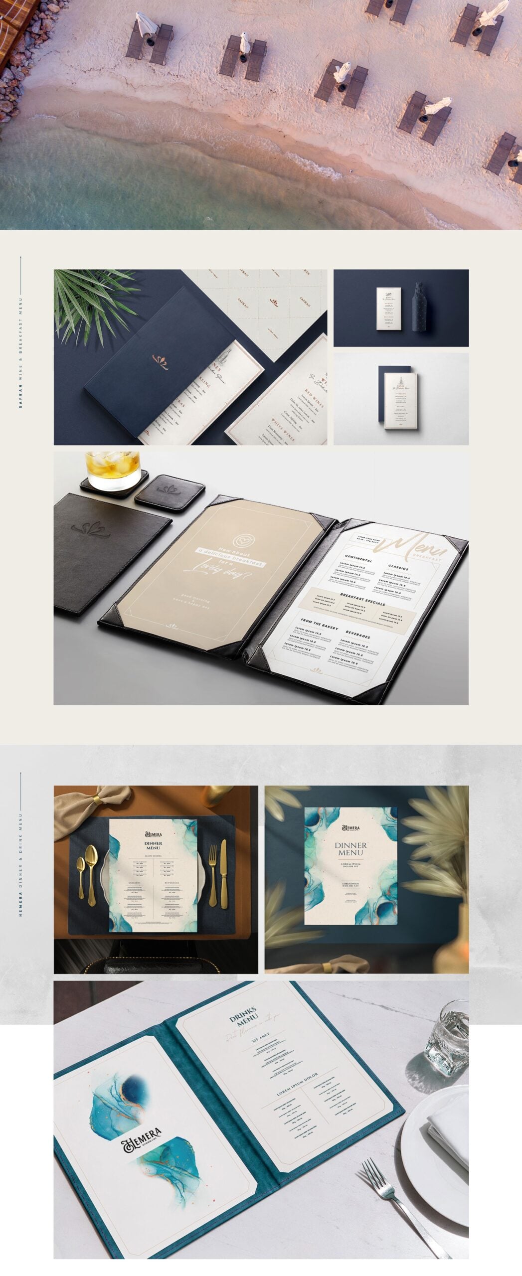
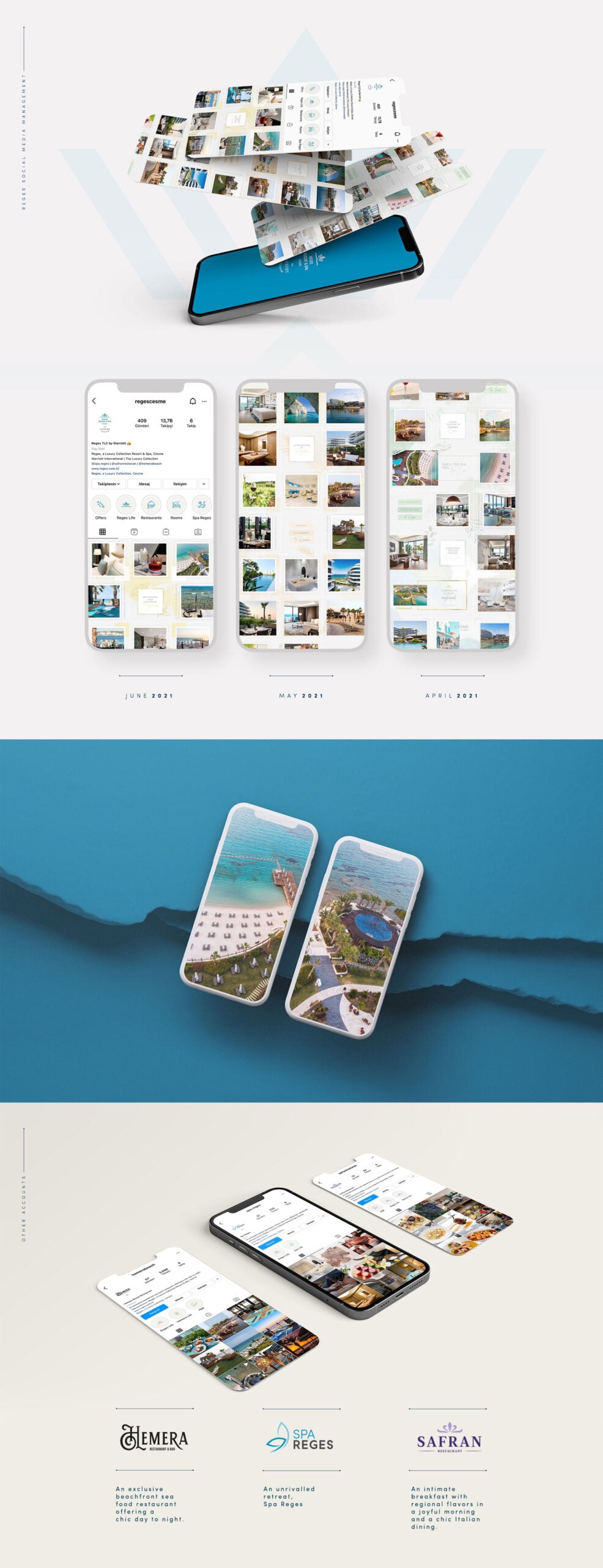
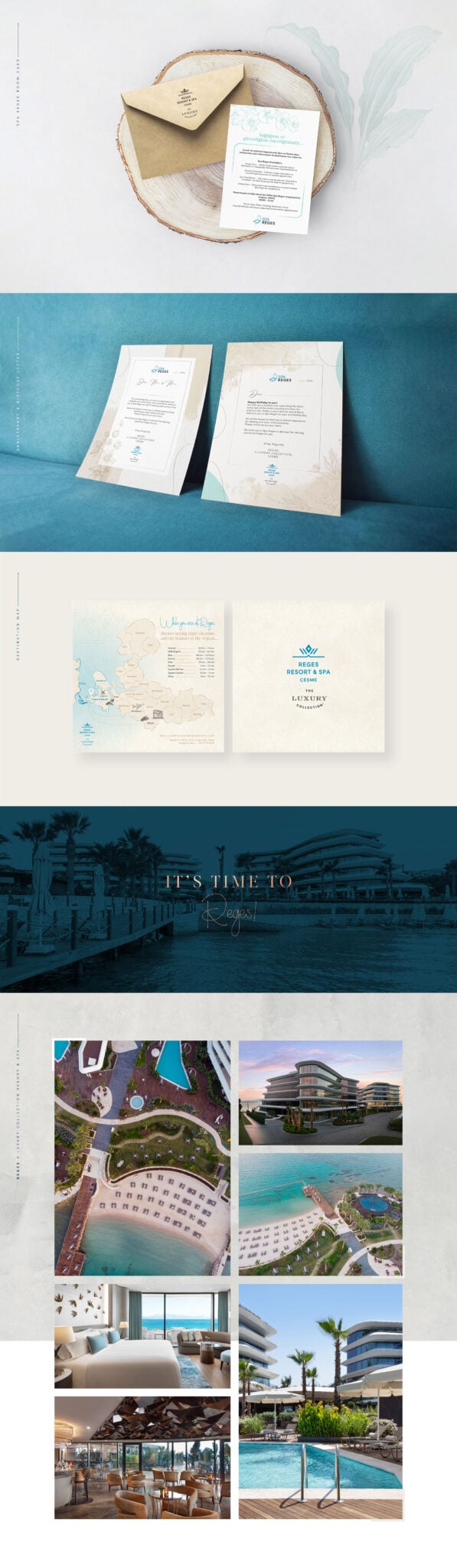
The complete branding concept includes a logo and logotype, color system, typography selection, a brand guidelines document, business cards, letterhead, key-card designs, and social media templates — all unified under one luxury identity system.
Every application, from a key card to a social media post, was designed against the same core material references (stone, olive, sea), so the brand feels coherent whether a guest encounters it on the resort's website or in their hand at check-in.

Place-Rooted Visual Language
Every color, texture, and material reference ties back to Çeşme's actual coastline and architecture, avoiding generic luxury-resort visual clichés.
Multi-Application Logotype System
A refined serif logotype tested and refined across favicon, signage, and print scales, not just a single hero lockup.
Documented Brand Guidelines
A complete guidelines document lets the resort's own team apply the identity consistently across future materials without ongoing agency dependency.
Design details
Under the hood
Typography
A refined serif logotype paired with a warm, humanist sans for supporting text — timeless rather than trend-driven.
Color palette
Components
A full guidelines system covering logo usage, color, typography, photography direction, and 6 core print/digital applications.
Responsive design
The logotype includes a simplified monogram variant for small digital touchpoints (favicons, app icons) where the full logotype loses legibility.
The results
What it delivered
Complete identity system: logo, color, type, and guidelines
6 core brand applications designed (cards, letterhead, key cards, social)
4-week concept-to-guidelines turnaround
Place-rooted palette distinct from generic luxury-resort branding
A polished, timeless brand identity that elevates REGES from a local resort to a destination brand — ready for print, digital, and environmental application.
“Placeholder client quote — replace with real words before launch.”
Tools & technologies
What we built it with
FigmaAdobe IllustratorAdobe InDesign