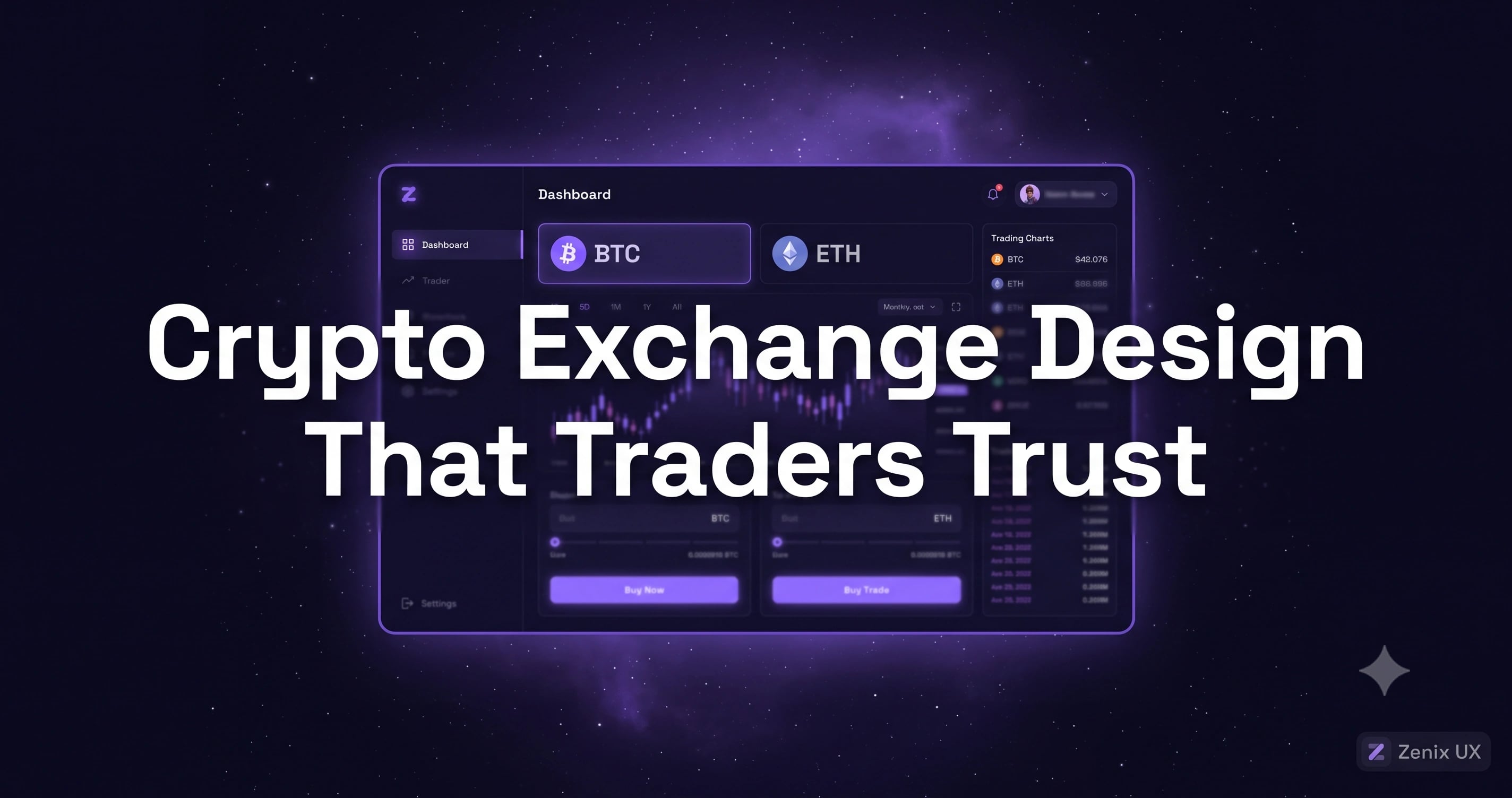
How to Design a Crypto Exchange That Traders Actually Trust
By Zenix UX · July 14, 2026 · 11 min read
Crypto has a trust problem that predates any individual platform — years of collapsed exchanges and rug pulls mean every new trader arrives at least a little skeptical. Your interface either compounds that skepticism or actively works against it. There's not much middle ground.
Why Trust Is the #1 Design Objective
On most fintech products, trust is one design consideration among several — usability and speed often get equal billing. On a crypto exchange, trust has to come first, because a trader who doesn't believe your platform is secure will never deposit long enough to evaluate anything else about it. Every design decision, from typography to loading states, either reads as "built by people who know what they're doing" or it doesn't.
The Landing Page: First Impressions for Skeptical Visitors
A crypto landing page needs to signal legitimacy before it sells features. That means real security credentials, clear information about custody and insurance where applicable, and a visual polish that doesn't read as a template thrown together in a weekend — which, fairly or not, is exactly what a rough landing page signals in this category.
KYC Onboarding: Making Verification Feel Safe, Not Invasive
Verification is the highest-abandonment step on almost every exchange, and the fix isn't skipping steps — it's explaining them. Visible progress indicators, plain-language descriptions of why each piece of information is needed, and reassurance copy placed exactly where users hesitate all measurably reduce drop-off. When we designed Taurus One's onboarding, treating KYC as a UX problem in its own right — not an afterthought bolted onto sign-up — was the single highest-impact decision in the whole engagement.
The Trading Dashboard: Charts, Order Book, Trade History
Exchange dashboards live or die on the same information-hierarchy principles as any trading interface — price and portfolio value first, deeper analytics one click down. What's specific to crypto is asset breadth: traders often track dozens of tokens, so search, filtering, and watchlists need to scale gracefully rather than becoming an unmanageable scroll.
Portfolio View: Holdings, P&L, and Asset Allocation
A clear portfolio view is often what separates a trading tool from a genuine investment platform in users' minds. Holdings broken down by value and allocation, performance shown over multiple timeframes, and gains or losses stated in both percentage and absolute terms give traders the full picture without forcing them to do mental math.
Security UX: 2FA, Withdrawal Confirmations, Suspicious Activity
Security features need to be visible enough to reassure without becoming friction on routine actions. Two-factor authentication should feel like a normal part of the flow, not a wall. Withdrawal confirmations deserve genuine friction — a cooling-off window, an email confirmation — precisely because that's the one action where a moment of extra caution protects real funds. Suspicious-activity alerts should use plain language and a clear next step, not a cryptic warning that leaves users unsure whether to panic.
Wallet Integration: Deposit and Withdrawal Flows
Address validation, network selection, and clear fee disclosure before confirmation are non-negotiable — a wrong-network deposit is one of the few genuinely unrecoverable mistakes in crypto, and good UX design is what prevents it. On Swapster, the swap flow shows the exact network and estimated fee before every confirmation, specifically to close off that failure mode.
Mobile Trading: What to Prioritize on Small Screens
Mobile crypto trading needs fast access to balance, quick buy/sell, and price alerts front and center. Deep charting and advanced order types can live in a secondary view — mobile users checking a portfolio between meetings aren't usually placing complex conditional orders from their phone.
Where to Start
If your exchange or wallet is struggling to convert visitors past sign-up, KYC and the first-deposit flow are almost always where to look first — they're the two screens doing the most trust-building work, or the most trust-eroding damage. We design exchange and wallet interfaces across trading and fintech, including projects like CryptOwl; reach out if you want a focused audit of yours.
Related projects
See it in practice
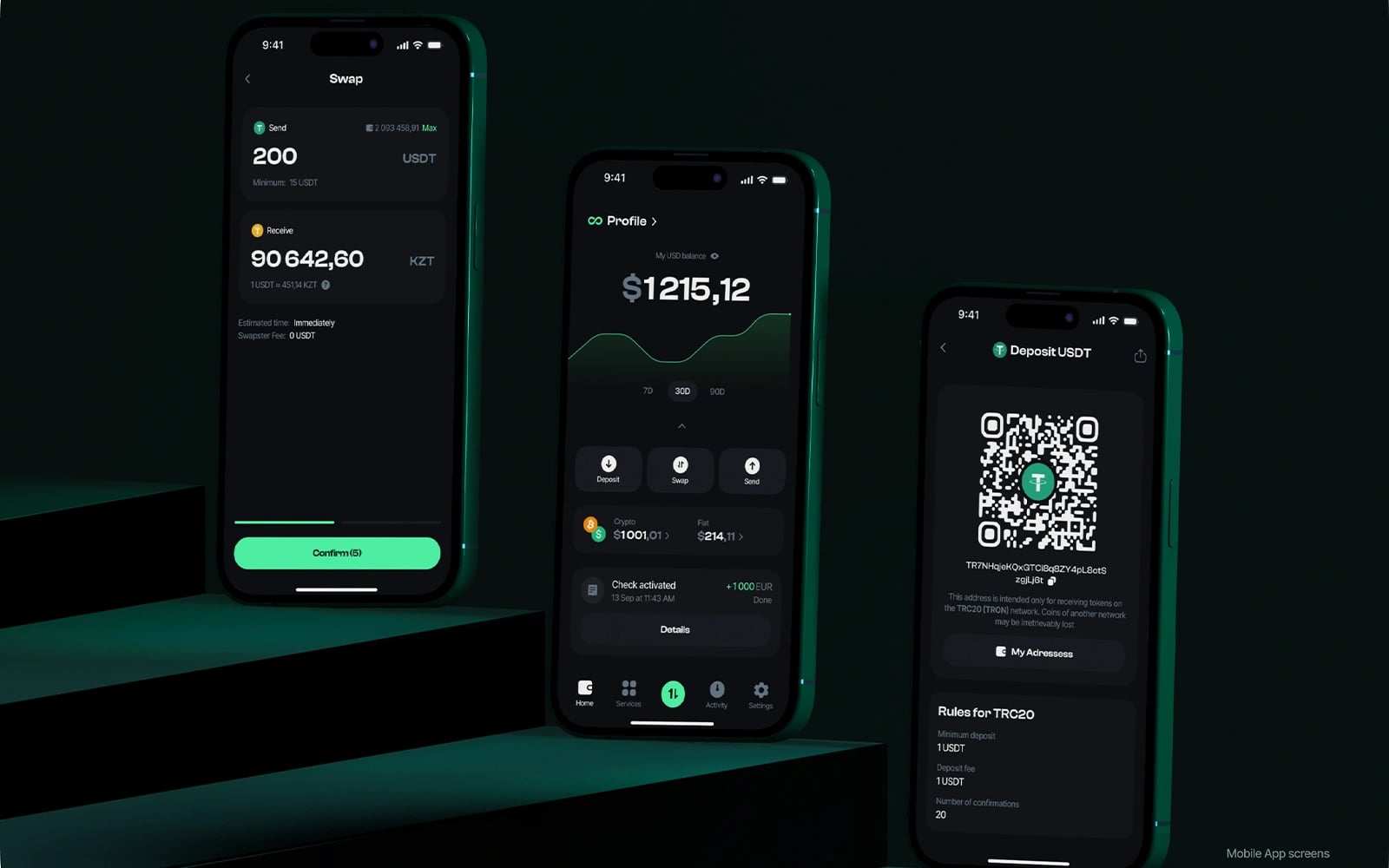
Crypto · UI/UX Design
Swapster — Crypto Exchange Platform
A fast, intuitive crypto swap and exchange platform — designed to make token trading feel instant, secure, and accessible to both newcomers and experienced traders.
View case study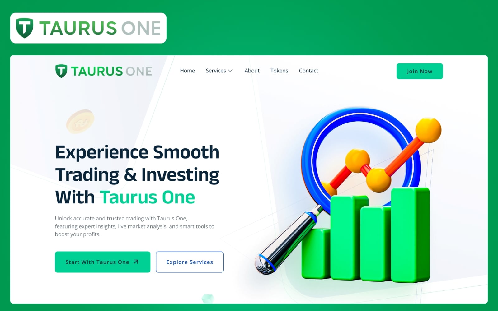
Crypto · UI/UX Design
Taurus One
A premium crypto exchange and wallet platform with a cinematic dark interface — designed for speed, security, and seamless multi-chain asset management.
View case study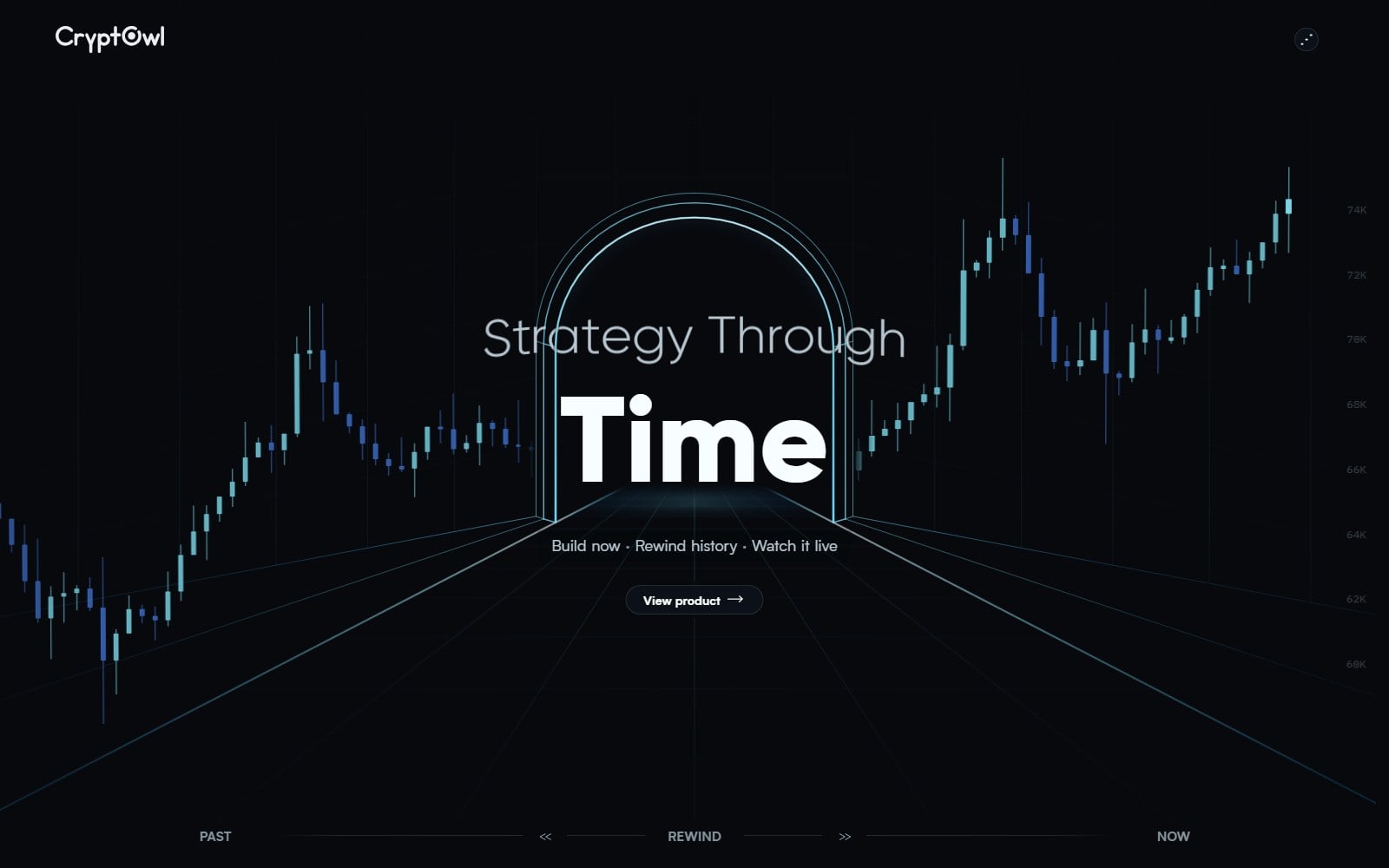
Crypto · Web Development
CryptOwl
A sleek crypto analytics and tools platform website — designed with a dark, data-driven aesthetic that speaks to serious crypto traders and DeFi users.
View case studyNeed help with your crypto exchange or wallet?
Start a projectRelated posts
Keep reading

Trading Dashboard Design: 15 Best Practices for 2026
Data-dense doesn't have to mean overwhelming. Here's how to design trading dashboards that make complex financial data feel simple and actionable.
Forex Trading Platform Design: What Retail Traders Actually Need
Most forex platforms are designed for institutional traders. Here's how to design one that retail traders understand and stick with.
Payment Gateway UX: Designing Checkout Flows That Convert
The checkout flow is where money is made or lost. Here's how to design payment experiences that minimize friction and maximize conversions.