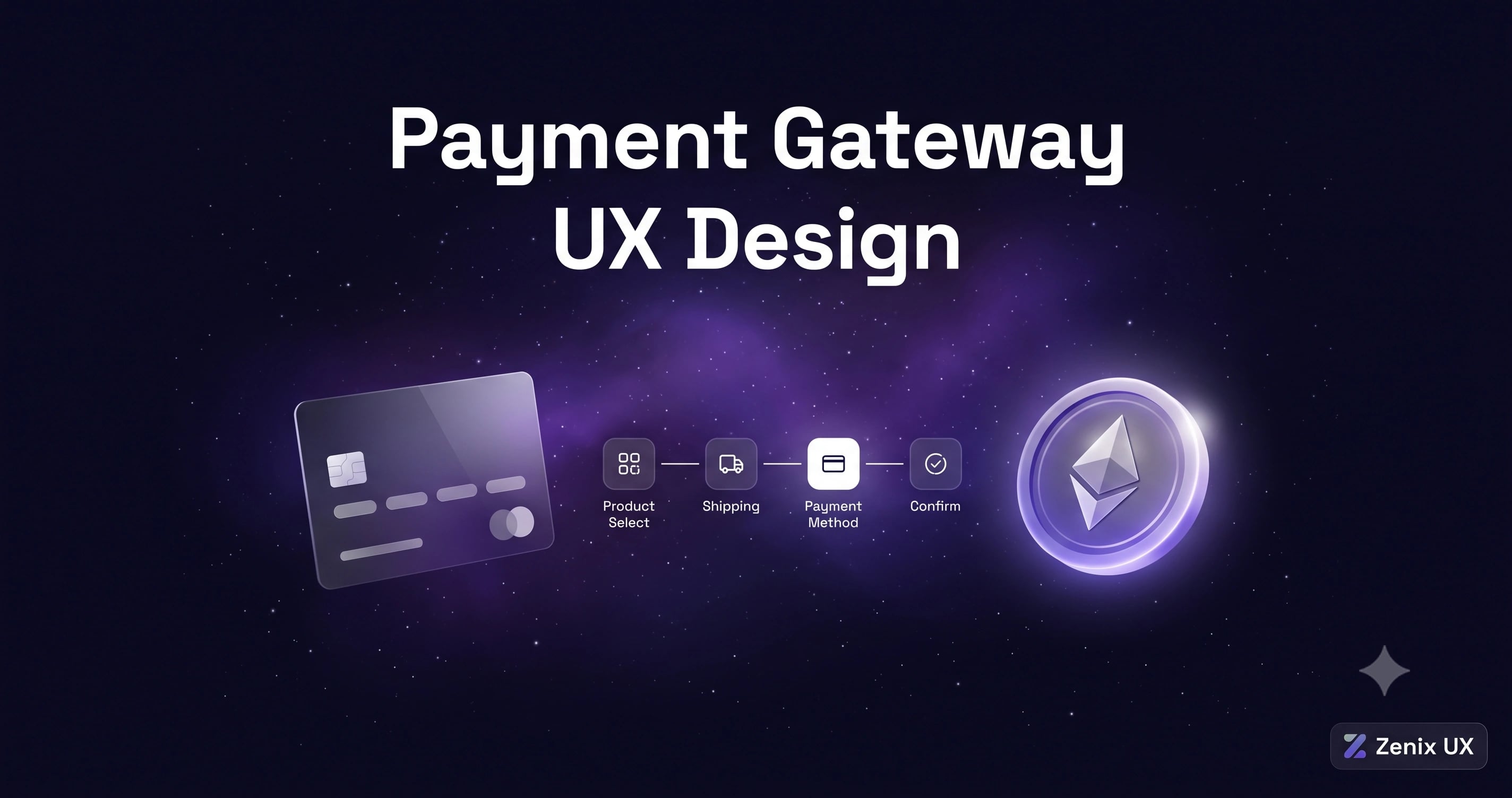
Payment Gateway UX: Designing Checkout Flows That Convert
By Zenix UX · September 8, 2026 · 9 min read
Checkout is the single most expensive screen to get wrong in any product that handles money. Every field, every extra tap, every unclear error message is a small tax on conversion — and unlike most UX problems, the cost of checkout friction shows up directly in revenue, easy to measure and impossible to ignore once you're looking.
The 3-Second Rule
If a user can't tell what to do next within about three seconds of landing on a payment screen, you've already lost a meaningful percentage of them. That means a single clear primary action, minimal visual noise, and no ambiguity about what happens when they tap confirm.
Card Payment UX: Formatting, Validation, and Preview
Auto-formatting card numbers as they're typed, validating in real time rather than only on submit, and showing a live visual preview of the card all reduce the small moments of doubt that make users second-guess whether they entered something correctly. None of this is novel, but a surprising number of payment forms still skip it.
Crypto Payments: Wallet Connect, QR Codes, Network Selection
Crypto checkout has its own failure modes — wrong network selection being the most costly, since it can mean genuinely unrecoverable funds. Clear network labeling, QR codes sized and positioned for easy scanning, and explicit confirmation of the destination address before funds move are non-negotiable. On Tripay, we treated network selection as a confirmation step in its own right rather than a dropdown easy to click past.
Multi-Currency Display and Conversion
Showing a price in a user's local currency alongside the settlement currency, with the conversion rate clearly stated, avoids the moment of confusion where a user isn't sure what they're actually about to pay. Hiding the conversion or only showing it after submission is a fast way to generate support tickets and chargebacks.
Security Indicators That Build Trust Without Creating Fear
Lock icons, encryption badges, and "secure checkout" messaging genuinely help conversion — but overdoing them, or pairing them with alarming language, can backfire by making users more anxious about a transaction that should feel routine. The goal is quiet reassurance, not a wall of security theater.
Error Handling: Failed Payments and Alternatives
A declined card is going to happen regularly at scale, and how the interface handles it matters as much as preventing it in the first place. Clear, specific error messages — "your card was declined by your bank" rather than a generic failure — plus an easy path to try an alternative payment method, keep a failed attempt from becoming an abandoned transaction entirely.
Saved Payment Methods: Convenience vs. Security
Saved cards and one-tap repeat purchases meaningfully boost conversion for returning users, but they need visible management — the ability to see, edit, and remove saved methods easily — so convenience doesn't come at the cost of a user's sense of control over their own financial data.
Getting Started
If your checkout abandonment rate is higher than you'd like, it's worth auditing the flow the same way we'd approach a full product: watch someone unfamiliar with it try to complete a payment, and note exactly where they hesitate. We design payment and fintech interfaces around minimizing exactly that hesitation — get in touch if you want a second look at yours.
Related projects
See it in practice
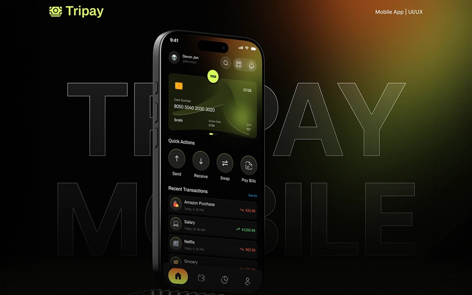
Fintech · UI/UX Design
Tripay — Payment Gateway
A modern payment gateway interface — designed for seamless transaction processing, merchant dashboards, and multi-currency payment management with a focus on trust and simplicity.
View case study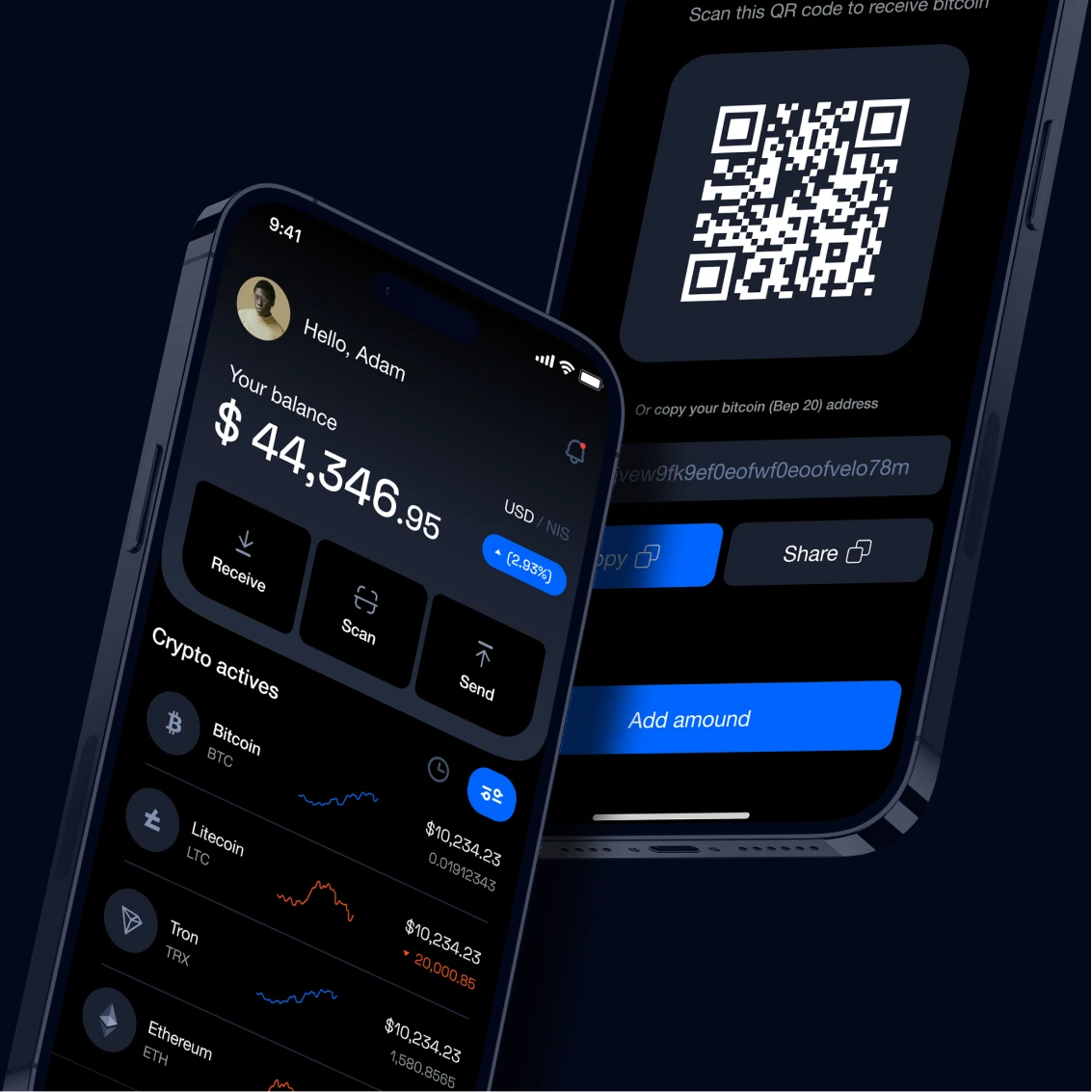
Crypto · UI/UX Design
Node Crypto Wallet
A secure, user-friendly crypto wallet interface — designed to make sending, receiving, and managing digital assets feel as simple as using a banking app.
View case studyNeed help with your payment or checkout flow?
Start a projectRelated posts
Keep reading

Trading Dashboard Design: 15 Best Practices for 2026
Data-dense doesn't have to mean overwhelming. Here's how to design trading dashboards that make complex financial data feel simple and actionable.

How to Design a Crypto Exchange That Traders Actually Trust
In crypto, trust is everything — and trust starts with the interface. Here's how to design an exchange that feels safe, fast, and professional.

Forex Trading Platform Design: What Retail Traders Actually Need
Most forex platforms are designed for institutional traders. Here's how to design one that retail traders understand and stick with.