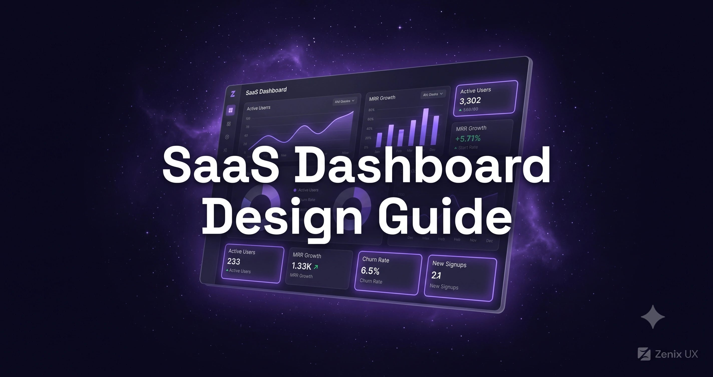
SaaS Dashboard Design: How to Reduce Churn Through Better UX
By Zenix UX · July 21, 2026 · 10 min read
Your dashboard is the part of your SaaS product users see every single day — far more often than your landing page, your pricing page, or your marketing emails. It's doing more retention work than any of those, whether or not anyone on the team is treating it that way.
The Dashboard Is Your Product's Face — Make It Count
A polished landing page and a cluttered, confusing dashboard is a mismatch users notice immediately after signing up — and it's exactly the moment trial-to-paid conversion gets decided. The dashboard doesn't need to be flashy. It needs to be immediately legible: what's the state of my account, and what should I do next.
First-Time User Experience: Getting to Value Fast
The single biggest churn driver in SaaS isn't a missing feature — it's a new user who never reaches the moment your product actually helps them. Good onboarding identifies that "aha moment" specifically and removes everything between sign-up and reaching it: unnecessary setup steps, empty states with no guidance, features surfaced before the user has any context for them.
The Home Dashboard: What to Show First
Lead with the two or three numbers that matter most for this specific product — key KPIs, recent activity, anything requiring the user's attention. Everything else belongs one click deeper. On MineBit, that meant real-time hashrate and rewards at the very top of the screen, with hardware diagnostics available for users who actually need that depth, but never cluttering the default view.
Data Visualization: Charts That Tell Stories
A chart should answer a question the user actually has — "is this trending up or down," "where's the outlier" — not just decorate the dashboard with data for its own sake. Choose the simplest chart type that answers that question clearly, and resist the temptation to visualize every available metric just because the data exists.
The Overlooked Screens: Empty, Error, and Loading States
These three states get designed last, if at all — and they're often what a brand-new user sees first, before there's any real data in their account. A well-designed empty state explains what will appear here and how to get started, rather than showing a blank table that reads as broken. Error states should explain what went wrong in plain language, with a clear next action, not a generic "something went wrong" that leaves users stuck.
Settings and Admin Panels: The Unglamorous Screens
Settings pages rarely get design attention, but they're where users manage billing, permissions, and integrations — friction here has an outsized effect on account expansion and retention. Clear grouping, sensible defaults, and confirmation on destructive actions matter here as much as anywhere in the product.
Design Systems: Consistency at Scale
As a SaaS product grows, a documented design system is what keeps new features feeling like they belong, instead of each new screen introducing its own slightly different button style and spacing. It also dramatically speeds up how fast your team can ship new features without a fresh design pass every time.
Measuring Dashboard UX
Time-to-first-value, feature adoption rate, and how often users return to the dashboard without a prompting email are better UX signals than raw session length — a long session can mean engagement or it can mean confusion. Track the metrics that reflect whether users are actually accomplishing what they came to do.
Getting Started
If your trial-to-paid conversion or monthly retention numbers have plateaued, the dashboard is one of the highest-leverage places to look before assuming it's a pricing or feature problem. We design SaaS products around exactly this kind of retention-focused UX — get in touch if you want a second opinion on yours.
Related projects
See it in practice
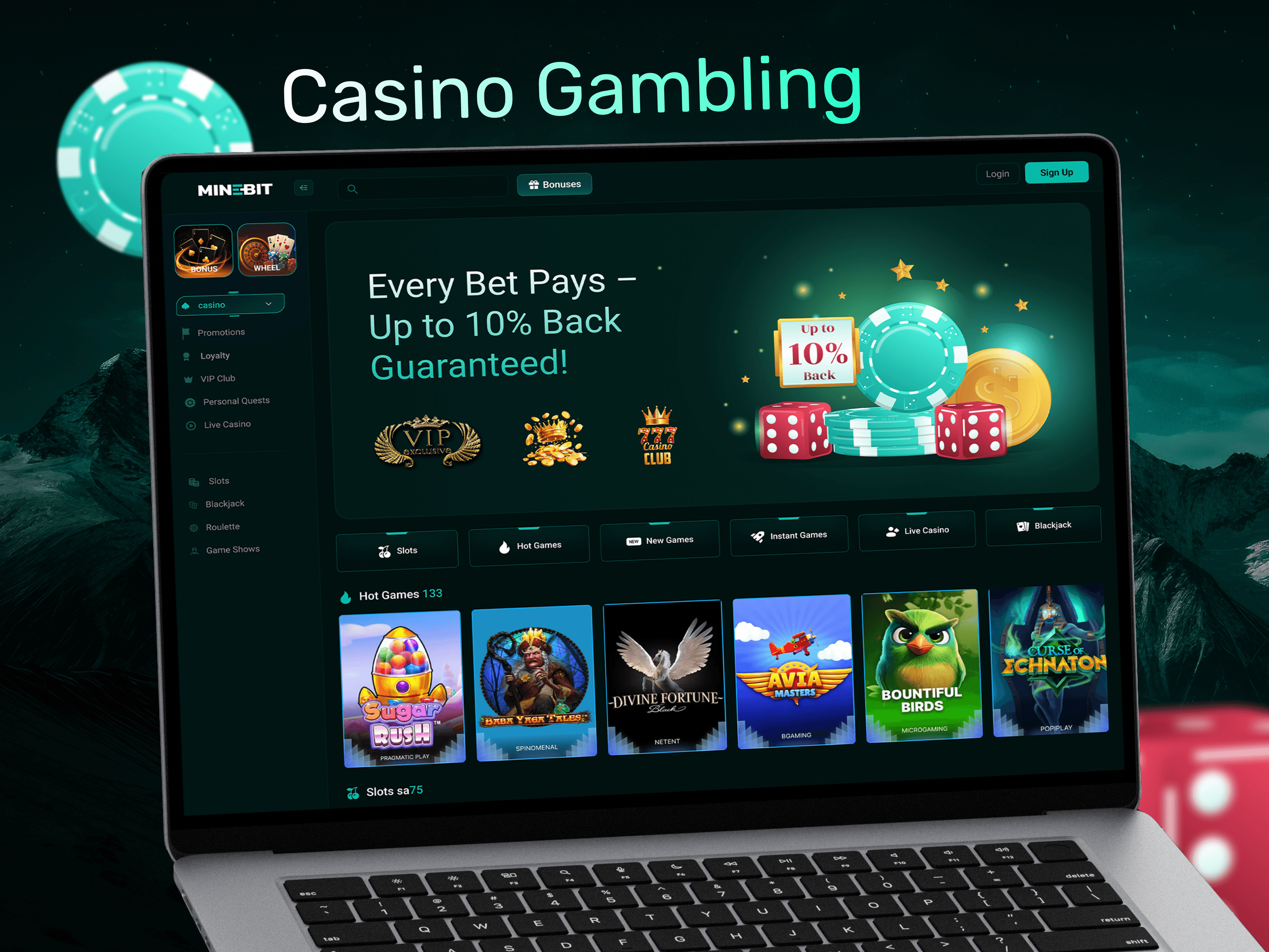
iGaming · UI/UX Design
MineBit — Mining Rewards Dashboard
A powerful mining rewards dashboard for an iGaming platform — giving players real-time visibility into hashrate, gaming rewards, hardware status, and pool performance without the complexity.
View case study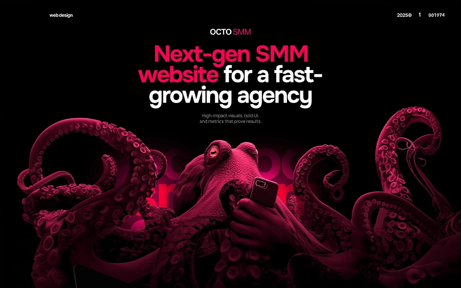
SaaS · UI/UX Design
Octo SMM — Social Media Marketing Platform
A modern social media marketing agency website with bold visuals, service showcases, and a conversion-focused layout designed to attract fast-growing brands.
View case studyNeed help with your SaaS product's dashboard?
Start a projectRelated posts
Keep reading

The UI/UX Design Process Explained: From Research to Launch
What actually happens when you hire a design agency? Here's our 4-phase process, demystified — so you know exactly what to expect.

Mobile App Design Cost in 2026: What You'll Actually Pay
Planning a mobile app? Here's what design costs from $2,800 to $31,900+ depending on complexity — with real numbers, not vague ranges.

The Best UI/UX Design Tools in 2026: What We Actually Use
Figma, Framer, Webflow — there are dozens of design tools. Here are the ones we use daily at Zenix UX, and why.